Winnin
Winnin Rebranding: Evolving a Brand for
Global Expansion
(3) Typography & Color Palette
(5) Website (mobile and desktop)
(6) Template for Social Media and Presentations
(2) Dynamic Personas by AI
(3) Purpose and Vision by AI
Having pivoted over the last decade to refine their successful business model, Winnin had grown significantly and developed a more sophisticated tool. However, their branding had not evolved to reflect this transformation. With a growing list of prominent clients and plans to expand into the U.S. and European markets, Winnin required a refreshed brand identity that showcased the technological sophistication of their platform and their position at the intersection of culture and data.
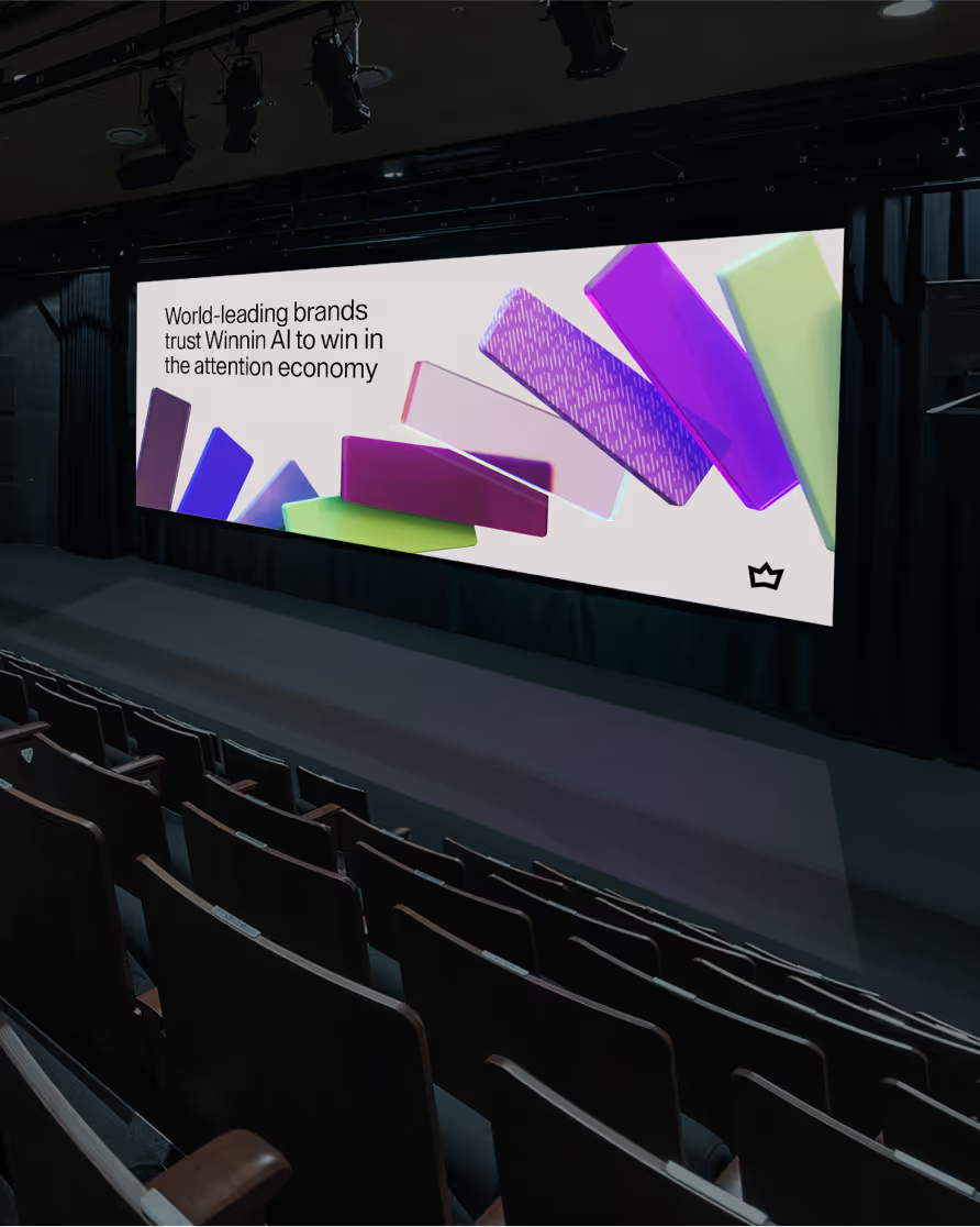
This rebranding revolutionized Winnin’s identity by creating a cohesive visual language rooted in its core values. We gave prominence to its proprietary AI capabilities, reimagined the brand’s color palette and typography, and introduced a dynamic system of visuals that mirrors the granularity and predictive power of Winnin’s Share of Attention metric. The result? A timeless, culture-driven identity that leads the market.
Every 3D element in Winnin’s visual identity was meticulously crafted to reflect the flow and structure of data. Inspired by behavioral patterns and insights, the 3D compositions bring cultural intelligence to life, transforming raw information into dynamic, engaging visuals that embody Winnin’s core values.
We crafted a visual identity that captures the pulse of culture relevance.
We crafted a visual identity that captures the pulse of culture relevance
The new Winnin website offers a seamless user experience, combining sleek design with intuitive navigation. Built to reflect its cutting-edge positioning, the interface balances simplicity and sophistication, allowing users to explore complex insights effortlessly. With a focus on usability, the site prioritizes accessibility and responsiveness, ensuring an engaging journey for every visitor.
We developed a comprehensive brand system for Winnin, hosted on a dedicated website that serves as a living guide. It details every aspect of the brand’s identity, including typography rules, color palette, logo usage, grid structure, and layout system, ensuring consistency across all touchpoints while allowing room for creative flexibility.
The Winnin rebrand transformed the company with a sophisticated visual identity that reflects its data-driven evolution, accelerating global expansion through a cohesive, scalable brand system that effectively communicates its unique cultural intelligence platform.
The rebranding successfully elevated Winnin's market position by creating a sophisticated visual identity that accurately reflects its evolution into a data-driven cultural intelligence platform. By aligning the brand's visual language with its technological capabilities, we've helped Winnin communicate its value proposition more effectively to high-profile clients and new markets.
Data Visualization Reimagined
The new approach to data visualization transformed complex cultural insights into intuitive, engaging visuals that are both dynamic and didactic. By crafting 3D elements that mirror behavioral patterns and cultural trends, we've made Winnin's sophisticated analytics more accessible and impactful, strengthening the connection between data intelligence and cultural relevance for clients.
The comprehensive brand system we developed provides Winnin with unprecedented flexibility and consistency across all touchpoints. The dedicated brand website serves as both a practical tool and strategic asset, enabling teams across different regions to maintain brand integrity while adapting to local market needs.
Creative Direction:
Fábio Simões, Pedro Burneiko
Design:
Pedro Burneiko, Laíssa Moreira
Motion design:
Francisco “Mauro Chicó”
Winnin
Gian Martinez, Rodrigo Maroni, Laura Rodrigues

CLARO, 100% AI-Powered Branding: Streamlining Telecom Rebranding

CLARO, 100% AI-Powered Branding: Streamlining Telecom Rebranding

CLARO, 100% AI-Powered Branding: Streamlining Telecom Rebranding

CLARO, 100% AI-Powered Branding: Streamlining Telecom Rebranding

CLARO, 100% AI-Powered Branding: Streamlining Telecom Rebranding


